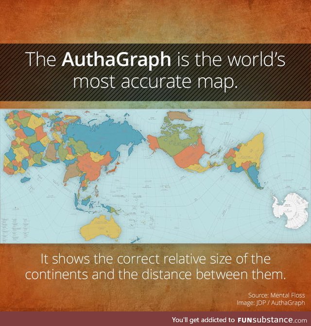
The AuthaGraph Is The World's Most Accurate Map
5 years ago by jones11 · 1132 Likes · 18 comments · Popular
Report
Comments
Follow Comments Sorted by time
iccarus
· 5 years ago
· FIRST
except Australia is much closer to Antartica than that
1
sir_spiderman
· 5 years ago
It's good to know we have someone here who is better at mapmaking than thousands of experts working in tandem for hundreds of years to make the most accurate map possible. Maps aren't simple. It is impossible to have a true flat map of a circular object without distortions in shape or area. This map does its best to peserve the area.
28
·
Edited 5 years ago
iccarus
· 5 years ago
don't claim to be better, but it states correct distance, i know how hard it is to portray a circular object on a flat surface, but i know what this represents as well
Show All
sublimegamer
· 5 years ago
It looks like it preserves the closest distance between a few select continents, not necessarily the distance between any two continents.
sir_spiderman
· 5 years ago
Not sure how it well it applies, but google says that Antartica is around 7 Australias away from Australia and it seems to match on this map fairly well.
3
iccarus
· 5 years ago
South America is 3-4 times further away from Australia than Antartica, Melbourne to Antartica, just over 3,000km, to Los Angeles, almost 13,000km
▼
iccarus
· 5 years ago
the length of australia north to south is 2,300 miles, 7 times that is 16,100 miles, considering that north and south poles are 12,400 miles apart, something doesn't add up
sublimegamer
· 5 years ago
I wouldn't call any 2D projection map, "the most accurate". There are many different projections for different purposes, so generalizing "the best" is impossible.
12
guest
· 5 years ago
Ironically Australia is the only country right side up
guest
· 5 years ago
Well continent...the apac region
guest
· 5 years ago
All these comments and opinions, and NO-ONE noticed that Buckminster Fuller invented a WAY more accurate map, about 75 YEARS ago! Search "dymaxion map". Looks like this effort featured is simply riding on the coat-tails of the original thinker.
1
sir_spiderman
· 5 years ago
Not quite. This map was made with the intention of fitting very well onto a rectangle which the dymaxion map does not without half the map being useless space. It also doesn't really match very well for deciphering where two places are when they would normally be immediately next to each other.
guest
· 5 years ago
Wait why is the U.S.A not in the center of the map
itsamemaria
· 5 years ago
So the glove is not proportional!? My life is a lie?
harperfan7
· 5 years ago
hmm, is greenland so small? Does brazil have such a huge bulge?
▼
guest
· 5 years ago
Canada is larger than the U.S.A
bugout
· 5 years ago
This is rubbish. The continent of Africa is easily 4 times the size of Australia, look up square km's for confirmation. Sudan by itself is roughly the same size as Australia.
iccarus
· 5 years ago
apparently logic is thrown out on this because "someone said so" makes a valid point. Antartica is 7 "Australias away", but doing mathematics, lost on some, the length of australia north to south is 2,300 miles, 7 times that is 16,100 miles, considering that north and south poles are 12,400 miles apart, something doesn't add up
1