Menu
1
Popular
Trending
Fresh
All
Substances
Funsubsters
GIFs
Videos
Media
Shop
Top
Top:
Posts
Comments
Users
Chat
More
Search
Submit
Sign Up
Login
Feedback Form
Fun Blog
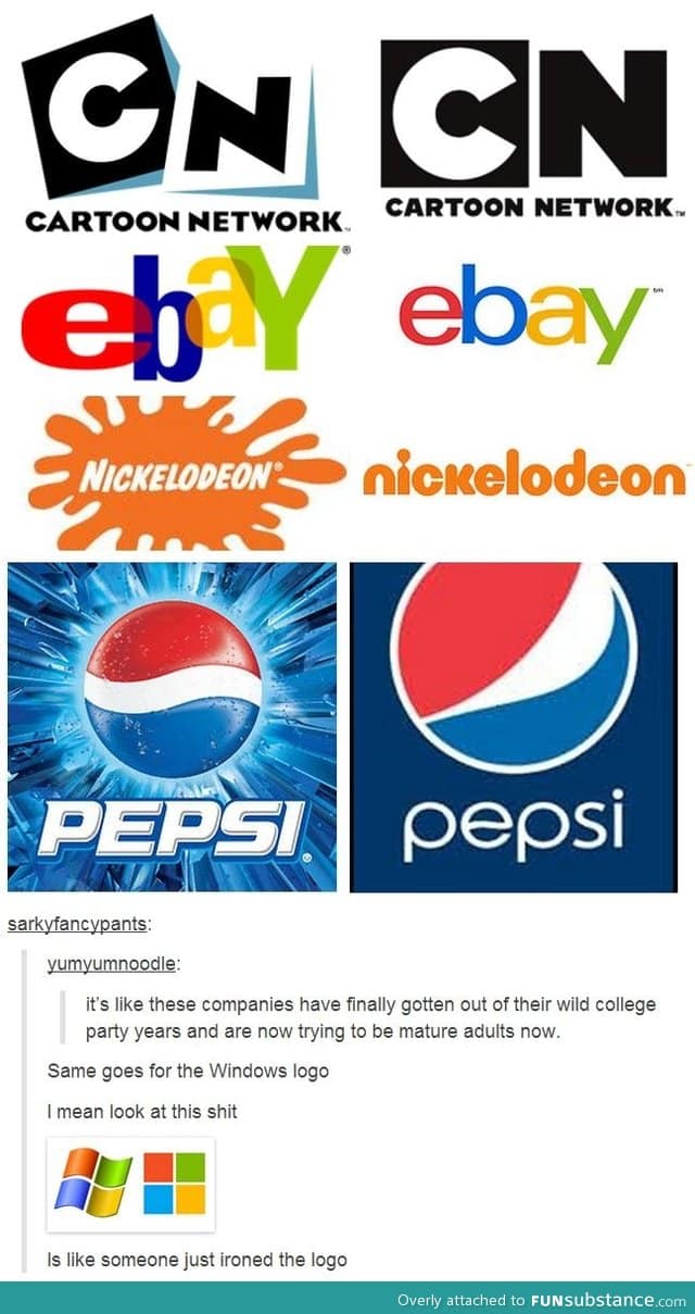
Company logos getting mature
Comments
Show More Comments
Follow Comments
Sorted by time
deleted
· 12 years ago
·
FIRST
It's like when you get older and you change your email from
[email protected]
to
[email protected]
41
guest
· 12 years ago
I laughed way to hard at this
9
lime894
· 12 years ago
Or
[email protected]
to
[email protected]
▼
Reply
·
Edited 12 years ago
jwood
· 12 years ago
I like how they were like look they just ironed the logo. Wow
16
Reply
forevermoipics
· 12 years ago
Hahahaha iron the logo. Lol Windows, just lol
▼
Reply
notqueenelizabeth
· 12 years ago
I kinda like the modernistic feel of these new logos :/
shiwan
· 9 years ago
This is old but me too
Reply
quirkey101
· 12 years ago
I think the logos are just getting less creative...
4
Reply
guest
· 12 years ago
The originalpepsi logo is in the "e" of the new one
Reply
ronnoc25
· 12 years ago
It's almost like they updated the logos to IOS7...
Reply
5_12_levetation
· 9 years ago
This is how I said them in my brain:
CARTOON NETWORK! - cartoon network
EBAY! - ebay
NICKELODIAN! - nickelodeon
PEPSI! - pepsi
old was better
Reply
vinodhrajah
· 12 years ago
▼
lime894
· 12 years ago
Was that a joke?
3
vinodhrajah
· 9 years ago
does it looks like a joke?
Reply
Comments
CARTOON NETWORK! - cartoon network
EBAY! - ebay
NICKELODIAN! - nickelodeon
PEPSI! - pepsi
old was better