Featured Posts
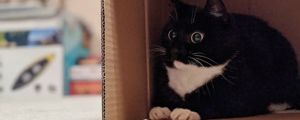
I wish I had a fort
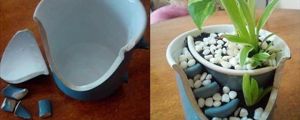
The powerof positive thinking
NASA
Pray for Australia
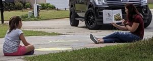
Take care of each other
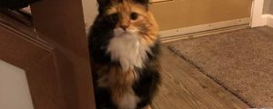
She has emerged
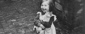
My soul feels so much better
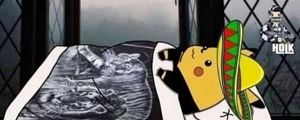
I just ordered one. #Just2019HispanicThings
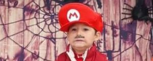
He really wanted his photo at the Halloween party, but was super scared of the spiders

The Only Thing More Contagious Than COVID19 Might Be This Fox's Smile
About
FAQ
Contact
Rules
Terms
Privacy
Feedback
Keyboard Shortcuts:
Previous Post · Next Post · + CTRL Skip Post
Previous Post · Next Post · + CTRL Skip Post
© 2026 FunSubstance · funny and entertaining pictures, memes, gifs & videos.
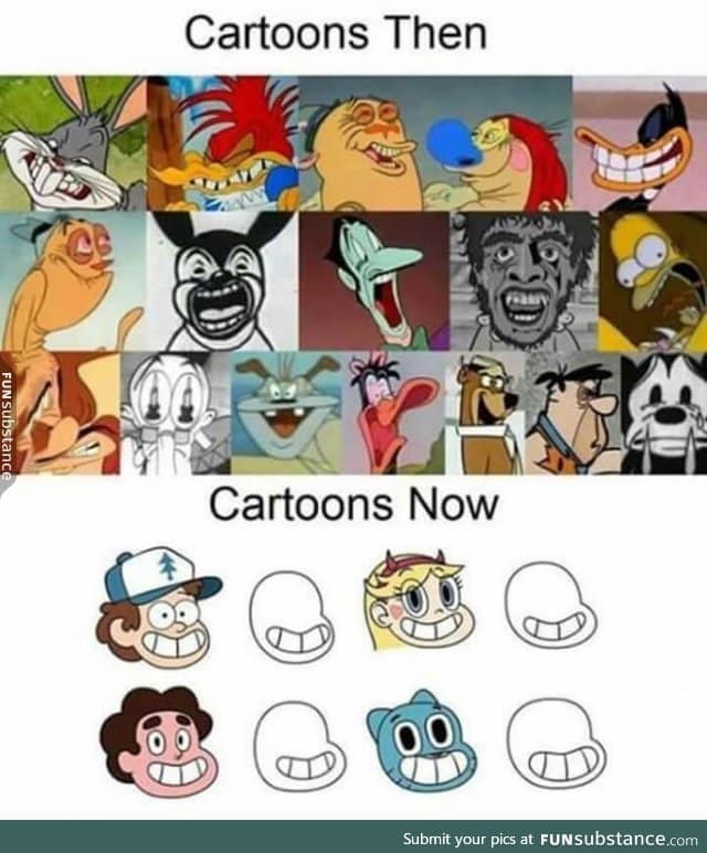


tl;dr= the scenes captured for the "past" animations are all actual screen caps while the "present" animations were all morphed from their normal animation to fit an oversimplified circle.
Might i add the top ones are mainly in-between frames, which are normally out of proportion to make animated movements more fluid. Cartoons nowadays have those too, but not as much.