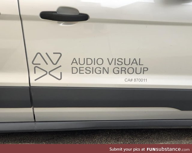
Oddly satisfying logo design
7 years ago by ri7g · 1294 Likes · 2 comments · Popular
view source ·
Report
Comments
Follow Comments Sorted by time
xvarnah
· 7 years ago
· FIRST
If they all didn't line up, or all DID line up, that'd be one thing. But the bottom half lines up and the top half doesn't, and the more I look at it the more it bothers me
4
curlhairedude
· 7 years ago
It should be Audio Design Group Visual
·
Edited 7 years ago
