Comments
Follow Comments Sorted by time
guest
· 6 years ago
· FIRST
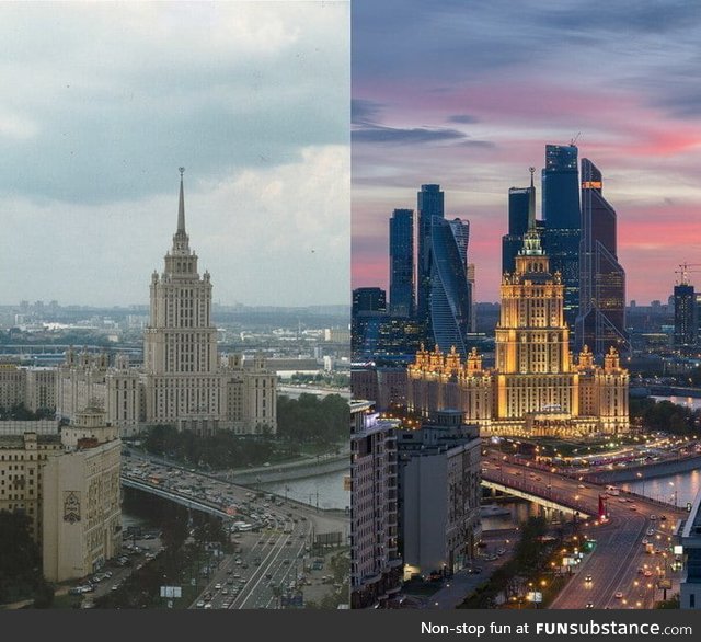
The one of the left looks so much better it's insane. Stop adding junky, cultureless blocks to the city. The skyline is much more beautiful in the first one. And of course they had to cherrypick and use the greyest picture they could find for the left, and on the right they chose a pink sky, and it's all lit up and shiny with lights. The buildings are horrible. It's really sad how we take away beauty like this and add a bunch of cultureless clutter.
▼
dovedee
· 6 years ago
Long days in Moscow...
▼
rabbitleaf
· 6 years ago
The left one is better.
