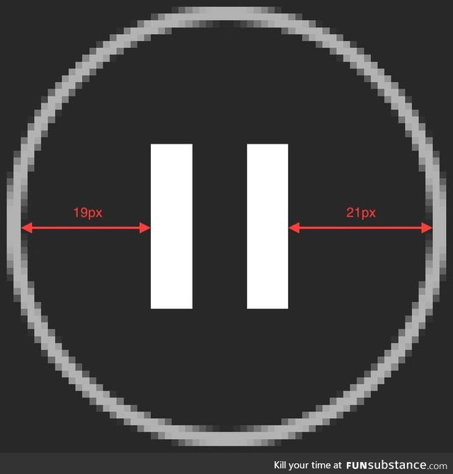
The Spotify pause button is off-centered by one pixel
6 years ago by duiyuolo · 367 Likes · 3 comments · Trending
Report
Comments
Follow Comments Sorted by time
willfree
· 6 years ago
· FIRST
Welp, time to switch to Tidal
3
mrscollector
· 6 years ago
And now I will never stop seeing that thanks
1
demon_razgriz
· 6 years ago
Companies always like to do small things such as this to make things look more natural. The Google logo is the perfect example, if you look closely , the G is not a perfect circle and the colour segments are uneven


