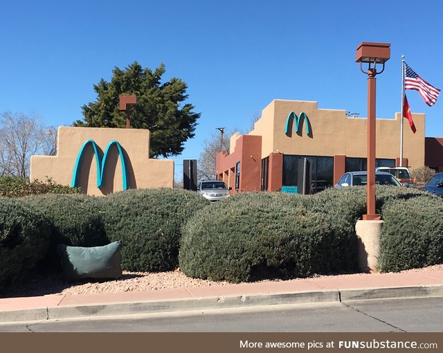
McDonald's change their sign to turquoise to better fit in with the aesthetics of the town
7 years ago by slayer · 1237 Likes · 7 comments · Popular
Report
Comments
Follow Comments Sorted by time
celticrose
· 7 years ago
· FIRST
It may be a restriction for the shopping center that they have no choice about. I've seen it in the really wealthy area shopping centers where every business is required to have not only the same color but sometimes even the same font on their signs
13
guest
· 7 years ago
This opened in the early '90's. They initially called them teal green arches, though. It's in Sedona, Arizona. The city has absurd restrictions on sign size, color, height, lighting, and building colors. The signs are so low, small, and dark, you'll end up driving by smaller shops if don't already know were they're at. Everything just blends together.
14
f__kyeahhamburg
· 7 years ago
If it's keeping people from eating at McD by not finding the shop, it's a good thing!
2
jensensbooty
· 7 years ago
No
3
dash224
· 7 years ago
Is this somewhere in New Mexico?
smercadante
· 7 years ago
Arizona
guest
· 7 years ago
Oro Valley Az has the same kind of rules for signs and buildings. It's like the whole city is an HOA.
