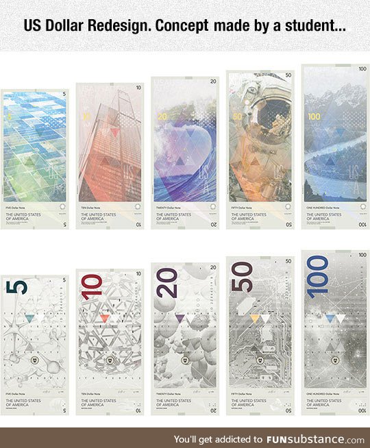
If anything the back should better represent the US. A single building, a wave, and a group of fields doesn't really represent the us. Personally I'd rather see the various state parks represented, more specifically 1 from each region so that all of the regions are covered. The front makes absolutely no sense to me whatsoever.
Looks a lot like the new Norwegian bills. And let me tell you, different sizes are golden. And even more so, different colors. I hate that every bill is green in the U.S., it takes so much longer for me to find the right amout. Or see if I have 4 or 200 dollars
Comments