Popular
Trending
Fresh
All
GIFs
Videos
Media
Funsubsters
Shop
Chat
Blog
Top
Posts
Comments
Users
1
Login
Sign Up
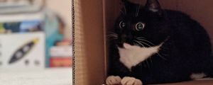
Could be that
1 year ago by
cakelover
· 318 Likes · 8 comments
· Popular
Report
Google+
Email
Facebook
Pinterest
Twitter
Comments
Follow Comments
Sorted by time
nelson
· 1 year ago
·
FIRST
Based living
4
Reply
typow777
· 1 year ago
Water
Reply
garlog
· 1 year ago
What's the orange square? Audio books or something?
1
ewqua
· 1 year ago
Yes, the icon of Audible, an audiobooks service.
garlog
· 1 year ago
Ah, I see. Weird that they didn't just use a picture of a book, but it gets the point across, I guess.
1
3 more replies hidden.
Show All
ewqua
· 1 year ago
Well, it sort of looks like an open book. But yeah logos can be weird.
garlog
· 1 year ago
Ha, I didn't even see that.
I just think that if you wanted to get the idea of "reading" across, an actual book would work better. Maybe I'm just old like that.
2
ewqua
· 1 year ago
Nah, I agree. Everyone tries to have minimalist logos nowadays to the point the consumer can barely tell what it's supposed to represent.
Reply
The FunSubstance app is here!
Go to mobile site
Featured Posts
I wish I had a fort
The powerof positive thinking
NASA
Pray for Australia
Take care of each other
She has emerged
My soul feels so much better
I just ordered one. #Just2019HispanicThings
He really wanted his photo at the Halloween party, but was super scared of the spiders
The Only Thing More Contagious Than COVID19 Might Be This Fox's Smile
© 2024 FunSubstance ·
funny and entertaining pictures, memes, gifs & videos.


I just think that if you wanted to get the idea of "reading" across, an actual book would work better. Maybe I'm just old like that.