Menu
1
Popular
Trending
Fresh
All
Substances
Funsubsters
GIFs
Videos
Media
Shop
Top
Top:
Posts
Comments
Users
Chat
More
Search
Submit
Sign Up
Login
Feedback Form
Fun Blog
One must be flexible
Comments
Show More Comments
Follow Comments
Sorted by time
deleted
· 8 years ago
·
FIRST
It looks exactly the same to me
18
that_creepy_guy
· 8 years ago
me too
5
gaaraotaku
· 8 years ago
Oh thank God. I thought I was the only one.
that_creepy_guy
· 8 years ago
I'm going to post something that shows the differences
2
Reply
mrfahrenheit
· 8 years ago
The recreated g makes my scalp itch
13
Reply
coldpasta
· 8 years ago
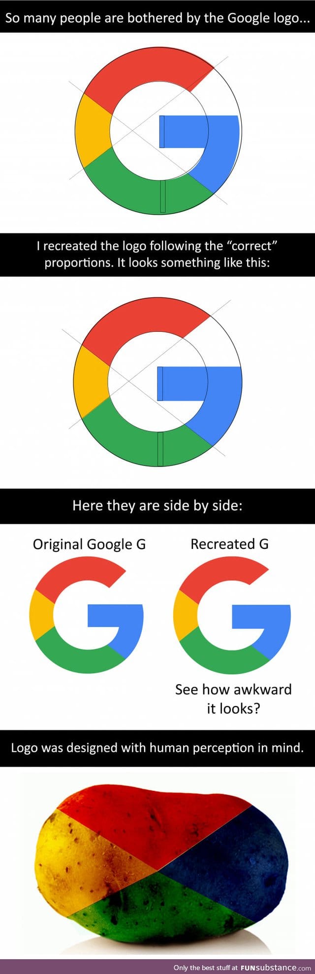
I can see why Google made it that way,
Simply bcz while writing the alphabet "G", we are always trained to pull the bottom right part towards the center, most handwritings and fonts observe this..
hence the Recreated G is weird..
17
Reply
guest
· 8 years ago
Typography 101
4
Reply
lucky11
· 8 years ago
That is really interesting to see.
4
Reply
garlog
· 8 years ago
No, it doesn't look awkward at all.
Reply
guest
· 6 years ago
Idgaf, but i prefer the second one. The original logo disturbs me
▼
Reply
Comments
Simply bcz while writing the alphabet "G", we are always trained to pull the bottom right part towards the center, most handwritings and fonts observe this..
hence the Recreated G is weird..