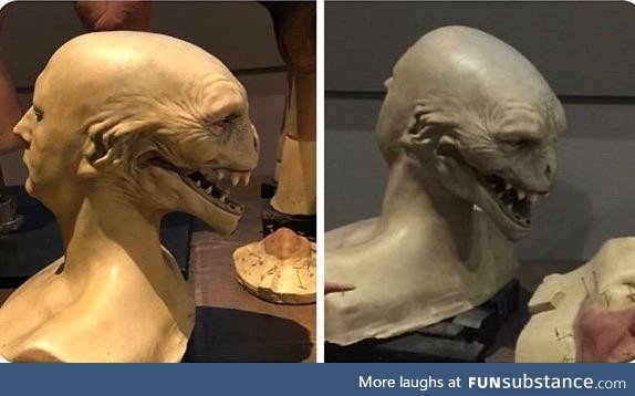
This was the first ever design of Voldemort, which I find far more terrifying
4 years ago by guest · 589 Likes · 7 comments · Popular
Report
Comments
Follow Comments Sorted by time
purplepumpkin
· 4 years ago
· FIRST
They were really onto something great with this mouth.
5
creativedragonbaby
· 4 years ago
He's supposed to look snake-like. But they just removed his nose and called it a day
6
ewqua
· 4 years ago
Looks more like a shark than a snake to me tbh but still, pretty cool.
2
creativedragonbaby
· 4 years ago
Yeah this doesn't look like a snake either, too many teeth
1
ewqua
· 4 years ago
Oh I know what he reminds me of now! I originally wrote shark because it was the closest thing I thought of at the time but now I clicked on the post again and I was like "he looks like a f-cking moray"
3
xvarnah
· 4 years ago
Admittedly this would be far more difficult to hide under a turban, but it's definitely more disturbing
2
hattricks1995
· 4 years ago
This would have been so much more terrifying as a kid.
3
